#11 Level Environments (or: Fog is always the answer)
Welcome to the eleventh devlog!
One of the major components I still had to create for level 1, was the level environment. Until now, the level was just “floating in space”. Everything around it was pitch black. Unless the game actually takes place in space, this usually looks really bad and amateurish, so I needed to create a proper environment.
These were the “requirements” I determined for the environment:
- It should fit with the level and make it feel like this is an actual location in an actual world.
- It shouldn’t grab any attention, but instead serve as a backdrop.
- It should not put a strain on performance => keep model size and material count as low as possible.
Especially the first two are kind of at odds with each other. You don’t want a level to feel “out of place”, but if the environment looks too similar, players can’t focus on the actual level! (And they don’t know when they are inside the level bounds, or when they’ve gone too far and exited the field.)
The idea
The “story” for this level is as follows:
They are building a new town, but it’s not finished yet. There’s holes everywhere, cliffs, some things are only connected by wooden planks, etc.
The construction works need their tools to finish the job – that’s what you’ll be delivering!
So let’s go through our requirements:
“Fit with the level”: my idea was to create two unfinished highways at the left and right side of the level. At the back of the level should be some rough mountains or dirt walls, as if the construction workers are digging a hole to construct this town. (This also nicely occludes the view.) And at the bottom should be a deep valley, so that the actual level feels like you’re walking on cliffs (and could actually fall to your death with a single misstep).
“Don’t grab attention”: even though there’s detail in the environment (bumps in the ground, height differences in the mountain, etc.), it’s very superficial and big. Yes, making stuff bigger grabs less attention in this case. Compare the following cases: a terrain that consists of four hills of roughly equal size, or a terrain with hundreds of extremely small, detailed hills. Lastly, the environment is colored a dark and desaturated brown.
“Don’t strain performance”: I created all the hills out of subdivided planes. (A plane is just a flat surface, like paper, and subdivided means that I divided the paper into rectangles of equal size). This allows me to create proper terrains, without adding much to the vertex count.
I also removed any faces at the bottom or the back, as you wouldn’t see those anyways.
Lastly, I divided the terrain into four separate meshes: left, right, bottom, back. In most cases, the camera will only see one or two of these meshes, so I don’t need to draw the others.
These meshes all share the same, basic material.
The result
With that in mind, I created the following environment. (First is a view from the editor, second is from within the game.)
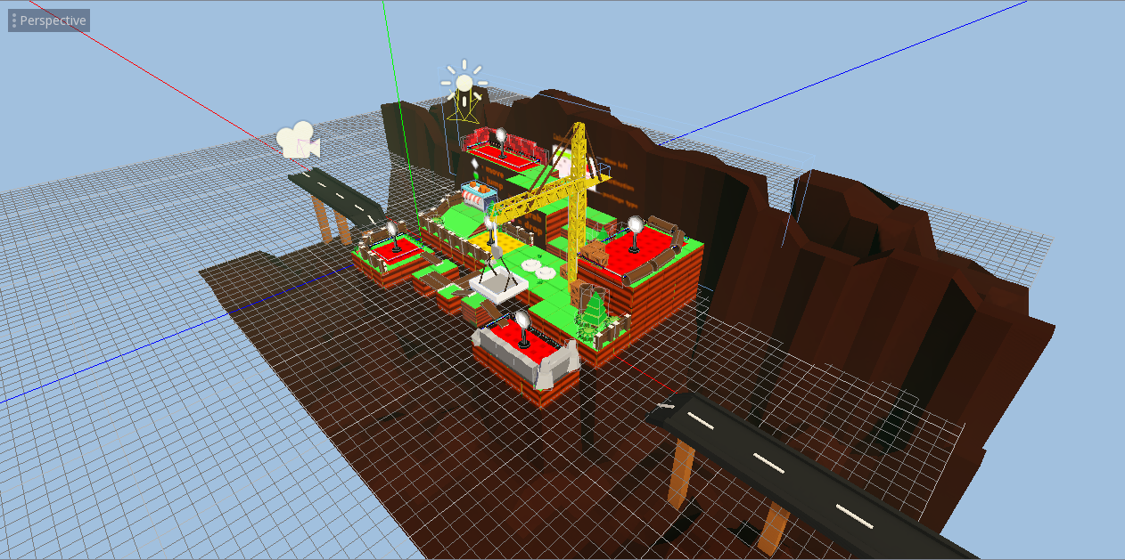
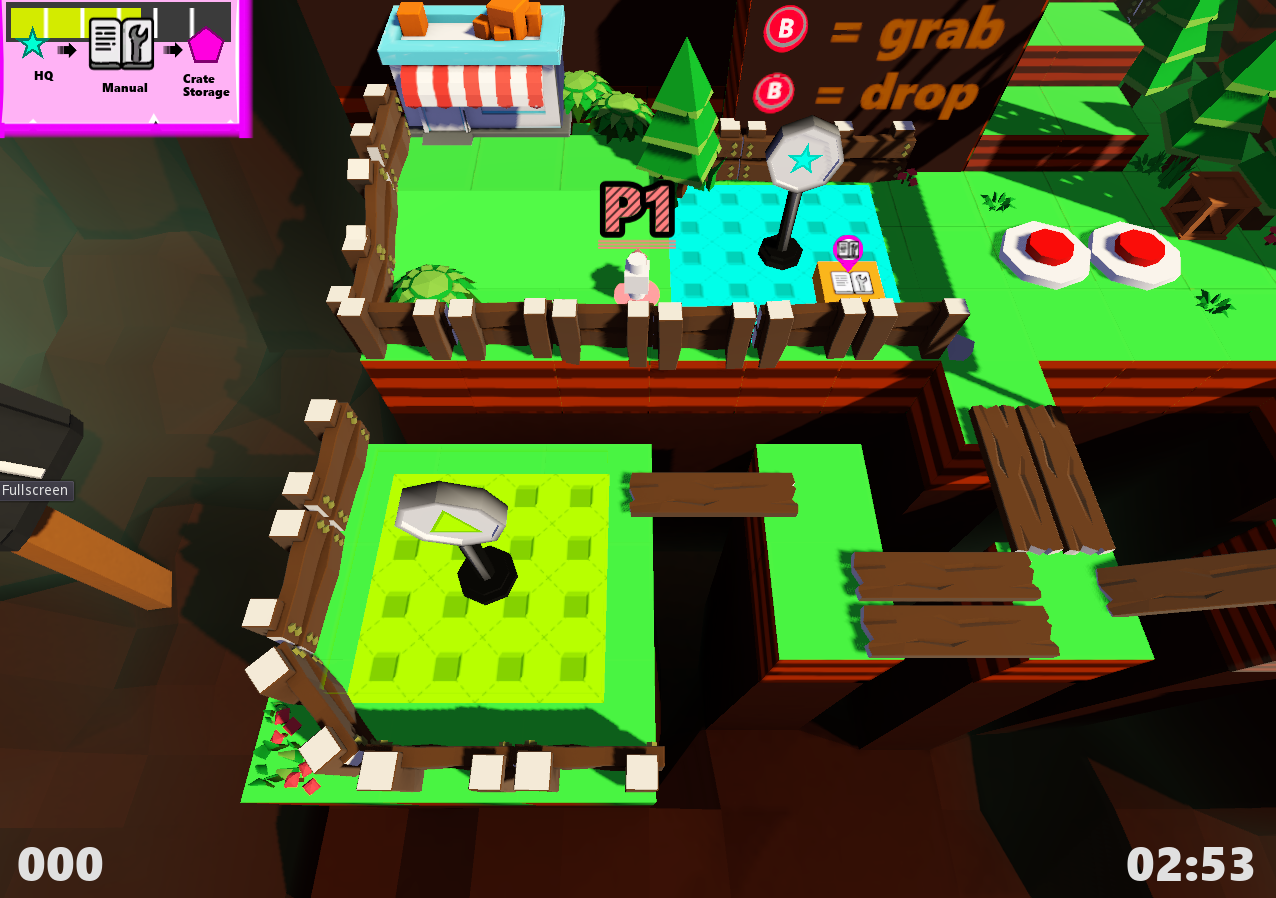
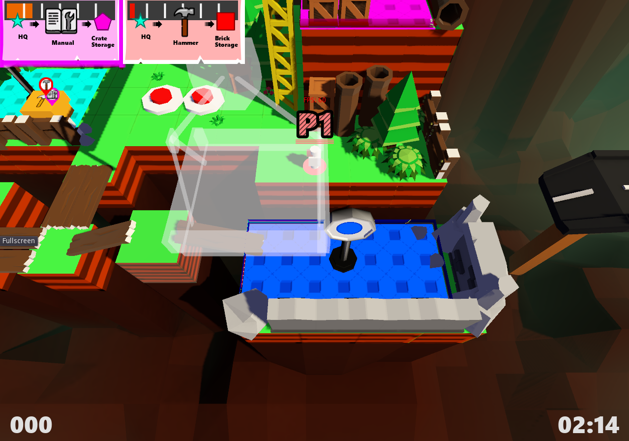
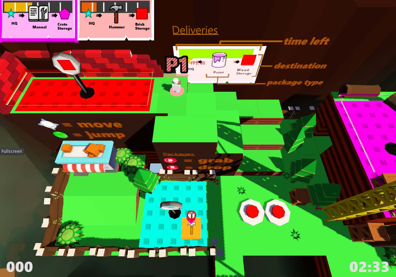
I find I underestimated the effect of the environment: I feel like the game suddenly looks 10x more professional, even though I only added something that doesn’t affect gameplay at all :p
I also want to make a remark about fog. As you can see, there’s a subtle green-ish fog around the level. The environment looks fine without it, but adding it gives it that extra touch. This isn’t the first time that I used fog, and I have to say that in all my previous games fog also made everything look better! So the real lesson is: if you don’t know what to add, add fog.
On a more serious note, the fog DOES hurt performance quite a bit. On my 6-year old laptop it runs fine, on a 10-year old iMac it reaches at most 40-45 FPS. In the final game, there will probably be many quality settings, and turning fog on/off will be one of them.
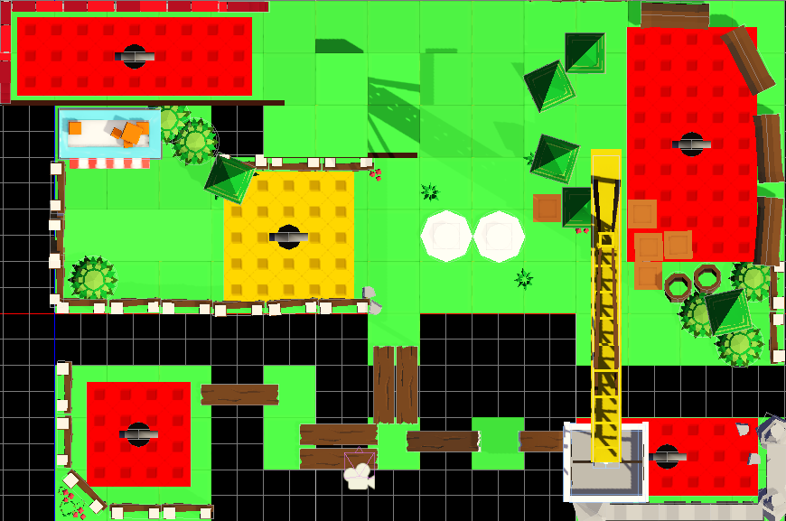
(Golden tip: I just remembered something that was very useful to my workflow. As I was creating the environment, I needed to make sure the dimensions were correct and everything would line up. To do so, I used a reference image from the top. (In Blender: go to top view, set reference image, make reference image slightly transparent so you can see through.)
I placed the camera in Orthogonal top view in Godot Engine, made a screenshot, and used that as reference image. (If you use Perspective, the image is warped (… by perspective), which makes it almost impossible to get good measurements and make models line up.)
Conclusion
Yeah, adding the environment really brought the game to a whole new level.
For most levels, I will use a similar treatment, but I’ll try to switch the actual environment around a little. (Giving every level mountain or forest surroundings becomes boring quickly.) In fact, for level 2, I think I will set the level “in the clouds”, as you’re standing on top of some scaffolding.
Because, as you might have guessed by now, the first world is heavily themed with “construction site stuff”. I don’t think this is a particularly compelling theme for a first world. (Imagine a parent saying to their kids: “Hey, you want to play a game about delivering packages to construction workers? Looks fun right!?”)
Here’s my two reasons for picking it anyway:
- It allows me to introduce the basic mechanics very smoothly. Because the world is “under construction”, I can leave out many mechanics without creating the feeling that something is missing. I also have many opportunities to make players skilled with walking and jumping (with the holes in the terrain and all).
- I’m going to turn the actual theme (and world title) to “a new world” or “new beginnings”. The idea will be that this is simply a new part of the world that has just been discovered, and they’re building their towns. The next chapter of the story is, of course, that the first towns have been build and now you need to deliver packages there!
Next time, I will be talking about the main “gimmick” of the first level: the huge crane, the buttons that control it, and how I used many (physics) tricks to make this work.
Get Package Party
Package Party
A couch co-op about delivering packages! (On time, and not completely damaged.)
| Status | In development |
| Author | Pandaqi |
| Genre | Action |
| Tags | 3D Platformer, Co-op, early-access, Family Friendly, Local Co-Op, Multiplayer, party-game, Physics, Puzzle-Platformer |
| Languages | English |
| Accessibility | Color-blind friendly, Configurable controls, Interactive tutorial |
More posts
- Devlog #31: Some good news, some bad newsFeb 29, 2020
- #30 Creating a WebsiteDec 22, 2019
- #29 Version 0.3 released - Thirteen levels!Dec 18, 2019
- #28 Evolving mechanicsDec 13, 2019
- #27 Why playtesting matters (a lot)Dec 07, 2019
- #26 Player modifiers/powerupsNov 30, 2019
- #25 Tutorial: dynamic maskingNov 23, 2019
- #24 Fun vs FrustrationNov 13, 2019
- #23 Version 0.2 - five levels!Nov 06, 2019
- #22 Pathfinding and Package TimersNov 03, 2019

Leave a comment
Log in with itch.io to leave a comment.