#14 Players (and how they want to see themselves)
Welcome to the fourteenth devlog!
The first weeks of this game’s development, every player was just two cylinders (a body and a huge nose). There was no way to tell which one was player 1 and which was player 2. As you might expect: the most common “criticism” during playtesting was that people were constantly confused as to their character’s whereabouts. (I put criticism between quotes, because these players know that the game wasn’t unfinished at all and that I simply hadn’t done anything with this yet.)
In this devlog, I want to talk about how I make sure players can easily find and follow themselves.
Player identification
I’ve talked about redundant design before, and this system is no different: every player needs multiple ways to recognize themselves, instead of only a single visual cue that they might miss.
Because I already had pickup zones and drop zones that required many colors, and I want to make the game color-blind friendly, I didn’t want to rely on colors.
Yes, each player has a different color, but I just used some light primary and secondary colors (no green, because that blends too much with the green terrain).
The primary means of identification are:
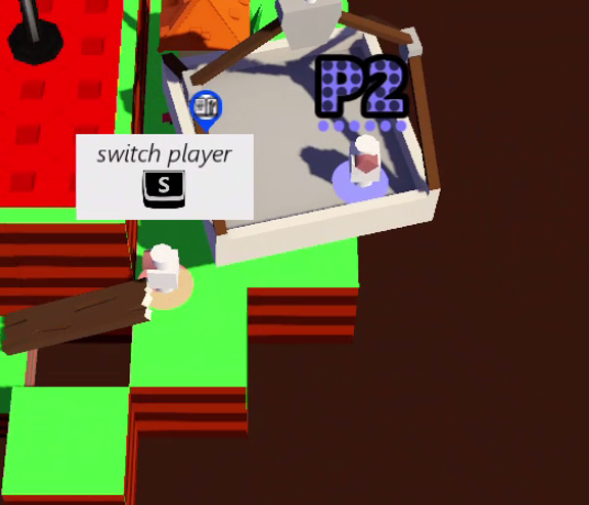
- The label above your head => Player 1 gets “P1”, player 2 gets “P2”, etc.
- Your pattern => Player 1 has a striped pattern, Player 2 has dots, etc.
I was quite curious if this would actually work, but I’m glad to say that it did. It took some getting used to, because I was used to players having nothing above their head for weeks. But new players thought it was brilliant and didn’t need to get used to it, so that’s great.
These were the final designs:

They are grayscale, so that the game can color them dynamically. You already saw how they look in-game in previous videos (as these devlogs currently aren’t in chronological order, but they will be soon, I promise!).
I might make them smaller, or shrink/fade away in certain situations, but in most situations they are clearly recognizable and don’t take up too much space.
Terrain circles
“Terrain circles” (that’s my name for them, there’s surely a better term) are almost a given in any game. It’s nothing more than a circle below the player, usually in the same color as the player, that is projected onto the terrain on which the player is standing.
There’s good reason for this:
- They are clearly visible. Because they are projected from the player onto the flat surface below, there’s rarely something obstructing the view.
- The terrain circle below the player nicely complements the player marker above him. No matter where you look around the player, you see something to immediately remind you which player you’re looking at. (And if the top/bottom gets out of camera view, you still know which player it is.)
So I decided to use them as well. I just created a circle and gave it the color of the player.
The player already had a RayCast at his feet, pointing downward, which checks if the player is standing on the ground. (This ensures players can’t jump again if they’re already in the air.)
This RayCast not only returns true/false if it’s colliding, it also returns the collision point and collision normal. That’s exactly what I need! I simply position the terrain circle at the collision point, and rotate it in the same direction as the normal, so it lays flat on the terrain (even if the terrain is sloped or irregular).

Currently, I like the way this looks. Some games have a hole in the circle (the “terrain donut”), some make the circle transparent. All of these things are options to try if the current set-up doesn’t work in future levels.
See-through effect
I’ve mentioned this several times before: because it’s a 3D game with a fixed camera angle, players can be hidden if they stand behind/underneath other objects.
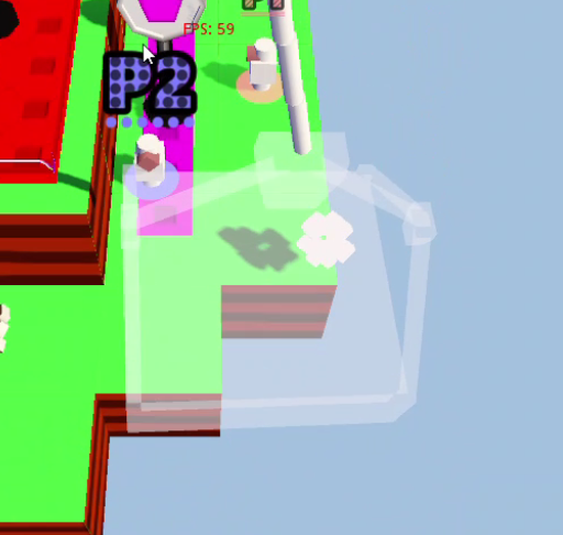
To solve this, I’ve decided to use a see-through effect: if a player is hidden, the game checks what object they are hiding behind, and makes it (mostly) transparent. I say “mostly”, because I want the obstructing objects to still be visible and recognizable. It looks better, feels better, and I don’t want players to be standing on a building only to see it completely vanish beneath their feet.

This is the exact implementation:
- Cast a Ray from the camera to the player position
- A Ray stops whenever it hits the first object. Therefore, whenever we hit something, we save this object as an “exception” and start again.
- This continues until we’ve found the player. (Usually, there’s nothing between player and camera, or at most one or two objects. Otherwise, if it was very common to have ten or more obstructing objects, this algorithm would be very slow.)
- Now that we have a list of all the objects, run through them and make them transparent. (This just switches to a different material for each mesh.)
- We also keep a list of all previously hidden objects. These objects are “un-hidden” after every check, otherwise they would stay transparent for the rest of the game.
Currently, this algorithm runs twice a second. It’s perfectly playable, but I might bump it up to 4 FPS ( = frames per second) or 8 FPS, just so it reacts a little faster. (I don’t allow it to run every frame, because it’s unnecessary and would drain performance very quickly. Players don’t suddenly teleport around the level, so rechecking the obstructing objects every frame would yield no different results.)
I’m also looking to move some other camera functionality to this “2 FPS” function, like determining if splitscreen is necessary. You save yourself 58 (computationally expensive) function calls per second, with the only disadvantage that the splitscreen initiates a few milliseconds later. Nobody will notice – probably.
NOTE: I’m still playing around with the see-through material. It’s currently just a very transparent white, but I’m trying to see if a black or grey would work better, or if I can use different blending modes.
Playtest results
I promised some more playtesting feedback/results, so here it is:
- It was a lot of fun! The difficulty curve is exactly right at the moment, I think. (The crane platform is still a little unstable, but that’s no big problem.) It teaches the controls, asks at least some skill. There’s room for errors, which are often quite fun. And there’s room for cooperation! (As we played, we figured out a faster way to deliver some packages in certain situations, which required us to put packages at convenient places for the other players.)
- There are a few annoying bugs, like the player sometimes falling through wooden platforms (no continuous collision detection? Framerate drops?), or the camera zooming out indefinitely if you’re in the platform together. Minor things, still annoying.
- Most importantly: we played the first level like six times. It was that quick, and fun, and easy to start again. And when we were finally done, they immediately asked: “I assume level 2 is finished tomorrow?” :p
It’s really coming together now. I know it’s only a level 1, and there’s many unfinished/unpolished things, but the game is proving itself fun and exactly what I wanted it to be. If I can continue this, I think this might actually become a really good game. (Don’t worry when a developer says this. We were basically made to doubt ourselves every day, until we – to our surprise – made a good final product.)
NOTE: When I booted the game, I got a lot of “oohs” and “aaah so cute” on the player design. What had I changed? I … eh … accidentally put a default cube on the player and forgot to take it away. So now the player is a cylinder, with a cube body, and a huge nose. And somehow, it looks really cute and not even out of place (between all the other more finished, colorful, detailed assets). You know what that means – let’s keep this basic design!
Conclusion
The paragraph above already was a kind of conclusion. Next devlog will be about making the game fun for all player counts (especially the solo player will need some extra work), and the one after that will be more in-depth about the campaign.
By that time, I expect work on level 2 to be on its way, so we can start talking about that!
Get Package Party
Package Party
A couch co-op about delivering packages! (On time, and not completely damaged.)
| Status | In development |
| Author | Pandaqi |
| Genre | Action |
| Tags | 3D Platformer, Co-op, early-access, Family Friendly, Local Co-Op, Multiplayer, party-game, Physics, Puzzle-Platformer |
| Languages | English |
| Accessibility | Color-blind friendly, Configurable controls, Interactive tutorial |
More posts
- Devlog #31: Some good news, some bad newsFeb 29, 2020
- #30 Creating a WebsiteDec 22, 2019
- #29 Version 0.3 released - Thirteen levels!Dec 18, 2019
- #28 Evolving mechanicsDec 13, 2019
- #27 Why playtesting matters (a lot)Dec 07, 2019
- #26 Player modifiers/powerupsNov 30, 2019
- #25 Tutorial: dynamic maskingNov 23, 2019
- #24 Fun vs FrustrationNov 13, 2019
- #23 Version 0.2 - five levels!Nov 06, 2019
- #22 Pathfinding and Package TimersNov 03, 2019

Leave a comment
Log in with itch.io to leave a comment.